STUFF-PHOTO.jpg

[ STUFF ]

THE DEVIL PRINT RELEASE //

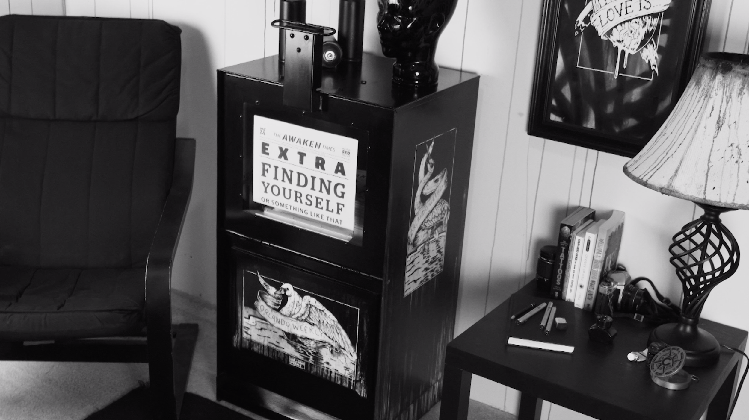
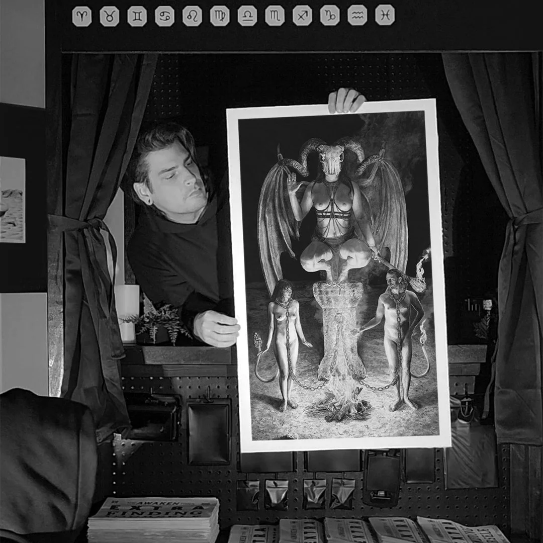
Quite a few people have been asking me to make a complete tarot deck, a challenge I would love to take on. Unfortunately, with only 3 card completed so far, it will take up a lot of time and resources to do so.

However, I have devised a plan and it requires your help. In order to begin the next card in the deck I am going to release a limited number of prints of an already completed one, starting with “THE DEVIL” card. I will use 100% of the profits from these sales to fund the completion of the next card.

In order to keep things inclusive to everyone I will be offering two different print sizes, a medium scale and full scale. That way as many people as possible can help support this endeavor.

If you are one of the people who have been asking me to do an entire deck, this is how we will make it happen. We can do it. I believe in us.

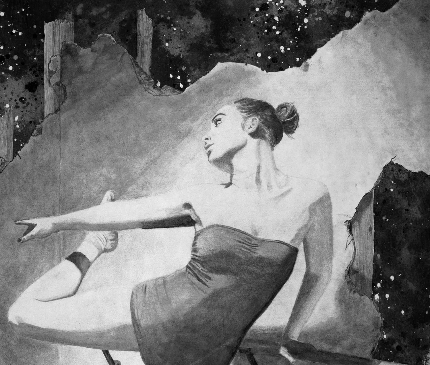
NOTE: These are reproductions of a watercolor painting created in 2022 for the solo exhibition “PAST//PRESENT//FUTURE”. They will come signed/numbered with a numbered certificate. All inks used are archival but framing is required to ensure proper longevity and to avoid fading.


THE DEVIL // TAROT SERIES

FIRST EDITION PRINT SPECS

[AVAILABLE IN TWO SIZES]


FULL SCALE PRINT:

PRINT SIZE:  32 7/8 IN X 19 7/8 IN

MATERIAL: RAG PAPER

INKS: ARCHIVAL

AMOUNT: [FIRST EDITION] OF 99

SIGNED AND NUMBERED CERTIFICATE


MED SCALE PRINT:

PRINT SIZE: 19 IN X 10 1/2 IN

MATERIAL: RAG PAPER

INKS: ARCHIVAL

AMOUNT: [FIRST EDITION] OF 999

SIGNED AND NUMBERED CERTIFICATE


THE ORIGINAL:

THE DEVIL painting can be purchased at Snap! Orlando during their 6th Annual Florida Showcase Exhibition opening December 15th 2023.


VISIT LINK BELOW FOR PRINTS:

www.LITTLEFIELDPAINTS.com/store/the-devil-print


Jason Littlefield
ORLANDO WEEKLY ARTIST BOX //

"THE PROCESS"

Above is a quick look into how it was made. I started off with painting over the AWAKEN design and did some black paint washes to give it some grunge. I like to live by the rule "75% grunge" anything more and then it just becomes a mess. Using a mix of illustrating with markers and photoshop I cleaned up the designs to get them ready to print. I have been messing around with this halftone process for a while and really love how the two come together. To add the halftones I create a full layer of them in photoshop, layer mask the whole thing out, and just go back and paint in where I want the halftones to show up. You can really go crazy here and add a ton of shading ranges but I stick with a 25%, 50%, and 75% amount mostly. A light, mid, and dark shading range basically.

For the printing process I had to get a little creative. Normally you lay whatever you're printing down on what is called a pallet. Unfortunately a pre-assembled metal box I wanted to print on the side of can't really do that. So I figured "let's avoid the pallet all together and print it off to the side of the press. Using an assortment of large screen printing screens and 2x4s stacked up I got it to the perfect height. Carefully wedging the rotating head of press with C clamps so it wouldn’t wiggle while I printed it l everything was good to go. I used a heat gun with a laser thermometer to make sure the ink was cured at a proper temp. I planned on sealing this when its finished so it should hold the ink on even more after that.

The front plate of the newspaper box was a bit easier to print as it was removable. I used my t-shirt press for this one. The metal was harder to get to the curing temp though so I finished it off sandwiched in my heat press to insure it was really cured. I could have probably got away with just the heat gun but it's better to be safe than sorry.

To wrap everything up I used a satin polycrylic sealer and gave it two solid coats. Letting the the water-based black paint sort of bleed into the first coat a little. Adding to the grunge. Then once dried sealed it fully with the second. If you don’t want your wash to bleed when you coat it use a spray sealer for the light first coat or use an acrylic paint for your wash. I like the organic grunge, some people do not.

If you have any questions about this process and want a more detailed explanation to something specific feel free to shoot me an email. I hope you all have a great start to your new year and have a great day.

Cheers,

Jason Littlefield

Jason Littlefield
2019 IS COMING TO A CLOSE //

[PART 1 OF 4]

"AWAKEN"

With 2019 coming to a close I have been reflecting back on all that has come and gone this year. It has been bitter sweet. I have gained so much but I have had to walk away from a lot of things that were extremely dear to me as well. Such is life. Nevertheless it has brought me to where I am today.

The AWAKEN series is a huge part of this. Really diving into this series has given me the opportunity to grow as a person and has taken me places I only dreamed I could achieve professionally as an artist. Finally showing it at Mills Gallery thanks to Anayansi Jones was a huge step for me. Redefine Art Gallery having faith in me and allowing me to show a majority of it all in one place alone was beyond what I could have imagined. Seeing it then pop up in more galleries like City Arts Factory and Snap! DOWNTOWN just was the icing on the cake. The feedback and response from viewers reminded me that I am on track with my ability to effectively communicate a specific message using only the imagery my mind conjures up. A task I will continue to work on until the day I die.

Because of all of this I am incredibly thankful for these experiences this year and all of the people involved. From all of you that have supported it by buying prints, showing up to events, chatting with me about what the art means to you, or simply just liking or sharing a post it means the world to me. I hope to continue this momentum into 2020 and I hope you all continue to support this madness along the way.

The moral of this all is simply...thank you. I can not do this without you. 🖤

PHOTO BY: Steve Sidle

Jason Littlefield
WHY I PAINT IN SERIES // AND YOU SHOULD TOO

Series of paintings...

What is the point?

-Good for art shows

-Helps define your style aka BRANDING

-Shows off your skills (pieces are no longer just happy accidents but instead a more thought out process and allows you to focus less on the process and more on the content)

What are my different series and why?

-Dream/Elemental Fetish/Sleepwalking/Awaken/AdVICE/Arouse

Closing point

- If you're looking to be taken seriously than take series seriously. 


Jason Littlefield
AWAKEN // SOLO EXHIBITION

AWAKEN is an exploration of the moments that happen in our lives that we all share as humans but end up defining us as individuals. Using the juxtaposition of abstract and surreal art styles to make art for the conversations that can bring us together. An awakening.

Working with only black watercolor the viewers focus is shifted to the subject matter rather than being distracted by colors and paint textures. What is left is stripped down and raw subject matter in surreal worlds.

OPENING RECEPTION:
THURSDAY, MAY 16th, 2019
6 PM - 9 PM

LOCATION:
REDEFINE GALLERY
39 S MAGNOLIA AVE, ORLANDO, FLORIDA 32801

Jason Littlefield
10th ANNIVERSARY B-SIDE SHOW

This Thursday (June 21st) B-Side is having its annual show at Cityarts Factory in Orlando. I will have some of my art in the show as well since I am lucky enough to have been apart of B-Side since 2012. You can expect to see a lot of urban inspired art with a hint of fuck you.


Cheers and I can't wait to see you all there.

Jason Littlefield